


An experimental audio player app built with the modern web, with focus on experience and performance.
Interface
Simple, modern look
The interface was designed to be clear and uncluttered, but practical and enjoayable to use at the same time. It’s a simple layout of three cards that are distinguishable from first sight:
-
Player card is the middle one, holds playback controls and the list of all songs added to the app, and is always visible to the user.
-
Info card on the right, which displays more information about the currently playing song, including the source link. It also holds a scrollbar that’s subtly hidden until needed.
-
And artwork card, which will only be visible when there’s a song playing.
Visualizer
An elegant, performant, and very accurate audio visualizer.
Just below the cards is the audio visualizer. It uses modern APIs to analyse each song in real-time without any pre-processings, and visualize the extracted information in simple, yet elegant way. It’s always ready when a song starts playing.
The app is optimized for the visualizer to run at 60 frames per second, but even if it’s not possible on a low-end machine, it’s designed to not affect the performance of the app itself, and the rest of the app will always take priority.
Tip
A friendly way to display contextual information to the user. Tip is only displayed when it’s most likely to provide helpful information to the user.
Tip was made to be very convenient through responding to user interaction. So, when the mouse pointer is moved over the tip, it’ll be visible until moved away, allowing the user to decide when it’s not needed anymore. Also, a simple message will be displayed when the tip is clicked, in case it’s not obvious what it is about.
Graduated into a separate project. Open-source and available at GitHub.
Tip will also give an indication for repeated messages, in case the user made the same action and expected a different behavior.
Background
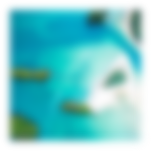
Beneath the cards lies a full-sized background, which is a blurred and dimmed version of the currently playing song’s artwork.
Blurring gives the background the effect of being out of focus, but uses the colors of the artwork at the same time. Dimming is applied to contrast the background from the artwork card, but is also a brightness protection for the visualizer and other parts of the layout in brighter artworks.
Technical problem: Background blurring
CSS offers a blurring filter effect, and although browser support is much better now, there are still multiple issues with it:
- Performance: Especially with big artworks, using CSS filter can result in big drop of frames while blurring happens.
- Blurring artifacts: CSS filter blurring also blurs the borders, which can be a good effect with layout elements, but not with images.

To solve these problems, a much smaller version is generated from the original artwork, and get handed to a fast JavaScript library used to blur and dim the artwork.
The image gets blurred at the smaller dimensions, but then gets automatically up-scaled by the browser using a trick to fill the image while keeping the aspect ratio. And since the image is blurred, no scaling artifacts will be visible on the image.
Animations
A very selective amount of animations were applied in this app. Choosing to add an animation had simple rules: it has to be fast, contextual, and visually pleasing. Because slow animations are irritating, animation without context is useless, and no one wants to see an ugly animation.
Fast, contextual, and visually pleasing.
To maximize performance, all animations were built using CSS animations when possible, and JS animation frames otherwise, and were all optimized and constantly tested to run as fluid as possible with a frame rate of 60 frames per second.
In all cases, animations never take priority over general app performance or navigation.
Ripples: Inspired by Material Design’s surface reaction guidlines, Ripples is an effect that runs on a button when activated, either by clicking or by a keyboard press. The result is a clear indication of action, and a satisfying visual effect.
Graduated into a separate project. Open-source and available at GitHub.
Play/pause icon morphing: When switching between play/pause states, icons morph from the current state into the other in a very natural way. This is to overcome the effect of “sudden” change of icons.
Technical problem: Artwork card animation
Artwork is © Tim Kellner.
Artwork card: Adding animation to the artwork card was not a straightforward task. The card opens in a critical time that is shared with a lot of other tasks and animations, e.g. player loading, background blurring and fading, visualizer start, …etc.
Reveal animations are complex.
That’s why it had to be as efficient as possible, and hence, using CSS was the optimal choice. After some experimenting, a “reveal” animation was found to be the best fit for the feel of the app. Reveal animations are complex, and usually require to be run through JavaScript for best visual results.
As a solution, a CSS animation was built on-load through JavaScript, while only using CSS properties that can be hardware-accelerated.
And just as important as deciding where an animation is needed, some tasks strictly have no animations, like searching and basic naviagtion.
Experience
Adding songs
Songs are added in an obvious way: pasting links. Single links, multiple links, links with protocols, links without protocols, …etc. If it looks like a link, it’s most likely to be recognized as one.
Pasting links.
For discoverability, a simple hint will displayed with the shortcut when no songs were added, including on first visit.
Storing
Song details, including artworks, get stored locally after being added, so they’re always ready for next visits.
Each song is made fully playable just after fetching the basic (and mandatory) information from the provider, while all artwork-related storing happens in the background. If its song is playing, the newly stored artwork is displayed right when it’s ready.
Technical problem: Storing artworks
Considering the case of adding a whole album to the library, with each song having the same album artwork included, sotring artworks can be very storage demanding, while having a lot of unnecessary duplicates stored.
The app recognizes identical artworks.
To solve this problem, the app recognizes identical artworks by generating a very fast hash for each artwork after being fetched. By comparing hashes, artworks are only stored once, minimizing the storage used while not affecting efficiency.
This optimization also enabled another experience enhancment, in which the artwork card won’t animate if both current and incoming artworks are identical.
Instant search
It’s the most natural way to search: just typing. Any time while using the app. No worries what portion of the app has the “focus”, or that typing will fire another unintended action.
The first result will be immediately focused and ready for action (play, delete, …etc), so you can look for a song and start playing it in less than a second. And if the first song isn’t the one, there’s always a shortcut to go to the next result.
You can look for a song and start playing it in less than a second.
A Tip will always display what’s been typed, to extra assure a search is happening, and in case there’s any missppelled words. When the Tip is gone, the search is over.
Keybaord accessibility
The whole app is fully accessible and usable with keyboard by itself, with very familiar keyboard shortcuts to keyboard users (spacebar to play/pause, right/left keys to seek, …etc).
Visual feedback will always be displayed no matter what device is used to initiate the action. So for instance, a surface feedback will also be displayed on the play/pause button when spacebar is pressed.
Also, the element in focus will have a clear indicator that is only visible when navigating using the keyboard (i.e., a focus-ring), for not ruining the visual experience of mouse users.
First-time experience & empty state
To kick-off using the app, first-time visitors are greeted with a selection of songs that they can include in their library only if they wanted. The offer will also be displayed when all songs get deleted, in case they are looking for new music to hear.
This panel will also display the single most essential instruction on how to add songs to the app, instead of flooding the user with tons of instructions they will never remember.
“The little things”

List overflow: When player card’s song container is overflown, a subtle divider will be shown to indicate the overflow in a very clear way. While scrolling, the divider will be progressivly appearing as needed.
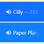
Song titles overflow: When the title of a song gets overflown, the title will gradually disappear instead of displaying ellipses or insatnt cutting the view. This keeps an elegant look, while still indicating overflow.
Tooltips will also be shown containing the full title and duration when mouse is over the song. To keep the interface clean, the effect and tooltips will only be activated if they’re really needed, i.e. the title requires at least one more pixel than the container’s width.
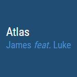
Featured artists recognition: Featured artists will automatically be recognized and displayed where they belong, in the “Artist” field.

SVG everywhere: The app uses zero raster images. Every image in this app is an SVG, hence always crisp, scalable, lightweight, and far more customizable and future-proof.